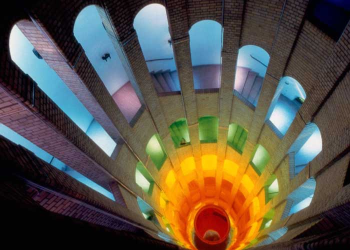
Colour can be applied to surfaces or as light to create interested and dynamic spaces.
As mentioned in our last post, the elements and principles of design are guidelines that inform and influence the way that interior designers conceptualize and realize spaces we design. When it comes to commercial interior design we look at how these elements and principles can help to enforce your brand and communicate it to your clients in a built form. We’ve already discussed the use of line; how varying direction, and combining them to create shape and form have a variety of effects on clients including evoking emotion and creating focal points within your space.
Colour is another extremely important and effective element in interior design. This is not a simple topic; colour is used not only to relate to your existing or emerging brand, but must be used carefully to encourage the proper associations, evoke the desired emotions and take into account the psychological effects deeply instilled in each. When your interior designer comes up with a colour scheme for your space this should all be taken into consideration.
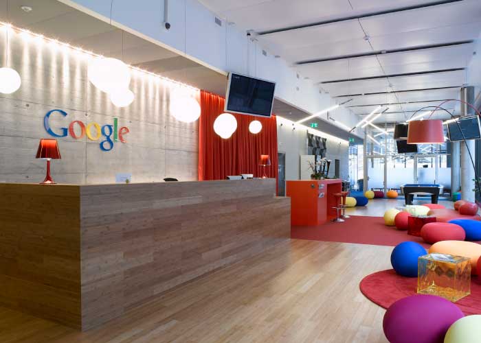
Google knows how to apply colour in a way that not only enforces their brand, but also to create a fun and interesting working environment that benefits their employees.
Colour Basics
Colour both affects and is affected by its surroundings and the colours in it, and is also affected by the colour of light that falls on it. This is easy to detect when observing an interior space with a lot of daylight over the period of a day. In an east facing space with a lot of natural light the colour exhibited in the morning with an abundance of natural, direct daylight will be much different from that at midday when only indirect daylight exists. In the same way, the type and colour temperature of the bulbs in your lighting fixtures will make a huge difference in the way colour is rendered within your space.
Terms like ‘primary’, ‘complimentary’, ‘warm’, ‘cool’, ‘hue’ and ‘tint’ are all common and important when considering the use of colour in interior design. For example, complementary colours are directly across from each other on the colour wheel, and when used together they really emphasize each other meaning that they appear to be more saturated. A neutral gray will appear warm on a blue (cool) background and cool when on a red (warm) background.
Colour is used to create focal points, aid in way finding and add personality to your space.
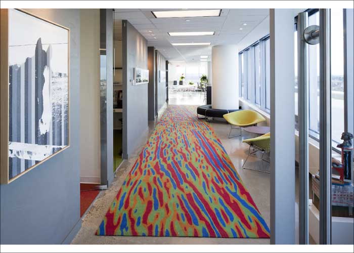
Jerilyn Wright and Associates are not afraid to apply colour, even to a corporate office setting. This carpet adds a pop a colour and also provides a sense of direction within the space.
Physical and Psychological Effects of Colour
Colour has been proven to evoke specific physical and psychological responses within our bodies. Red is considered the ‘physical’ colour; it has the ability to raise our pulses and create the illusion that time is passing faster than it is. It is also said by colour psychologists that red induces appetite; this is directly related to the physical effect red has on our bodies. Blue, on the other hand, is known as the ‘intellectual’ colour; it tends to affect us mentally by stimulating thought, communication and concentration. Yellow is considered the ‘emotional’ colour; it can evoke optimism and confidence in certain hues, but anxiety and depression in others. It is important that these factors be taken into consideration when designing the spaces that we live, work and play in. A good rule of thumb is that warm colours are considered to be stimulating, while cool colours tend to be more restful.
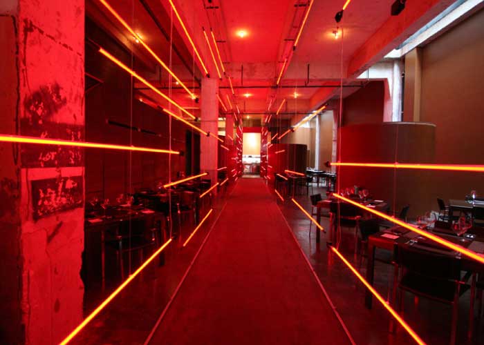
The Red Prime Steak restaurant by Fitzsimmons Architects takes advantage of colour psychology by using the colour red to increase appetites.
Colour also comes along with many associations that may be personally, regionally or even generationally related. Cultural associations revolving around celebrations and traditions (green and St. Patrick’s Day), political and historical associations (for Canadians red = Liberal and blue = Conservative), and contemporary usage and fads are all factors to take into consideration.
Colour and Spatial Perception
Considerations also need to be paid to the space and objects that colour will be applied to. Bright, warm colours tend to make objects appear closer and larger. Darker colours tend to make objects look heavier and smaller. Lighter colours seem to expand the boundaries of a space, while darker colours seem make a space feel closed in. These are very important tools that help to shape the feeling, appearance and atmosphere of a room. Painting a ceiling a dark colour will appear to lower the height, and applying a vibrant colour to a wall preceded by light coloured walls will create the illusion of a wider room.
Colour Schemes
There are a variety of colour schemes that can be utilized in design. For example, monochromatic describes a scheme that uses only one colour in various intensities and values. Another example is an analogous scheme which employs colours within 90 degrees of each other on the colour wheel. Each scheme provides designers with different guidelines for applying colour to an interior space.
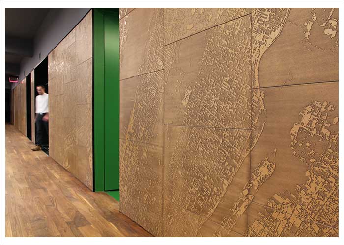
The offices of Octavian Advisors by Adjaye Associates utilizes a monochromatic colour scheme, except for the bright green elevator entrances. This is an effective way of using colour for way finding.
Colour is an extremely important aspect in any commercial interior. Your interior designer will ensure that they understand your company’s brand and culture, and that the colour they apply to your space strengthens this while creating the desired atmosphere within your space. Applying colour correctly will enforce your brand and help to create a space as unique as you are.
Did you miss our first post on the elements of design? No problem, read about it by clicking here.