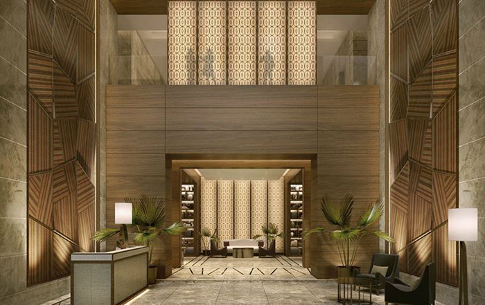
Balance is everything in design. Everything just feels right when a space is as well-balanced as the one above designed by BBG-BBGM.
Principles of interior design are achieved through the application of the elements of design. Unsure of what the elements of design are? We’ve got you covered; check out our previous blog series in which we provided an introduction to line, colour, texture and pattern, light, and scale and proportion. As interior designers we have become quite adept in applying both the elements and principles of design to our commercial projects to create interesting spaces that help to reinforce your brand and corporate message.
There are many principles of design, but this first post in our series will focus on balance. Everyone understands the importance of balance. One lesson that we learn quite quickly from a very young age is that without balance things tend to go sideways. Whether it be learning how to ride your bike, stacking wooden blocks or knowing when to take a break from work to enjoy some leisure time, balance is a constant in our lives. So, how does balance translate into interior design?

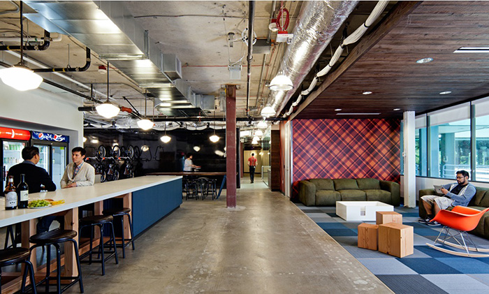
You wouldn’t guess that the above photo of Microsoft’s new office, designed by Studio O+A, is balanced, but it is. This is because it’s balanced in an asymmetrical way using variety in the visual weight of objects. Feels a bit informal and that’s probably exactly what the designer was aiming for.
Just as when we are off balance in various aspects of our lives, an unbalanced interior space can be uncomfortable. There are instances when this is the desired effect, but for the majority of spaces one goal is visual balance. This is achieved by distributing the visual weight of objects within a space to achieve a feeling of equilibrium. The size, color, texture, shape of an element can change its visual weight. For example, larger, darker, brighter, highly textured, complexly shaped objects typically feel heavier and require balance through the placement equally “heavy” items or multiple less heavy items. Balance can also be achieved in three ways: symmetrically, asymmetrically and radially.
Symmetrical Balance
Symmetrical balance is achieved when items are actually repeated or mirrored along a central axis. This type of balance is frequently seen in nature, our own bodies included. Symmetry is common in interior design and can portray a feeling of stability, calmness and dignity; however, can also be seen as static, dull and unimaginative. Symmetry can be achieved through the use of pattern, arrangement of furniture, fixtures and millwork, and through the application of colour.

A great example of symmetrical design, Lah! by Ilmiodesign mirrors the banquettes back-to-back to create order in a space that has a random, eclectic feel.
Asymmetrical Balance
Asymmetrical balance relates very strongly to the visual weight of objects. Rather than repeating the same item within a space to achieve balance, in this case we are using different elements with a similar perceived weight to achieve balance on the opposing axis. As stated above, complex shapes often feel heavier and for that reason are commonly used to achieve asymmetrical balance. Asymmetrical interiors tend to feel more dynamic and less rigid because in these spaces a variety of objects types are working together to create balance. This form of balance can be more difficult to achieve it often requires an “eye for design”.
Radial Balance
Just as it sounds radial balance is almost circular – distributed arrangement of items around a central point either extending outward or inward. Common examples of radial balance translated to the interior environment include chairs centered around a table, the structure of a circular rotunda, or even a circular lighting fixture. If you wish to create focus on a central item, applying radial balance (so that the your attention is directed inward) is a great way to achieve this.
 The boardroom designed by BAKOKO Architects in the image above is an excellent example of radial symmetry. Notice how the focus is on the centre of the table? We also get a real sense of vitality, but in a really organized way.
Whether by introducing different textures, colors, forms, or by literally creating symmetry in a space, interior designers often aim to create a feeling of balance. The way we create this balance (asymmetrically, symmetrically, or radially) can have an effect on your client’s perception of your space and, in turn, help them form an impression of your company culture. Make the right first impressions by hiring a registered interior designer to create the interior space that reinforces your company brand. Check back for future posts on the remaining principles of design: rhythm, emphasis, unity, harmony, and variety.
» Want to work with a company that specializes in commercial interior design? Contact Hatch Interior Design located in Kelowna, British Columbia – Because Good Design is Good Business.